Pre-Prototype User Research
Define User
Our target users will be people between the ages of 18 to 35 who enjoy large group environments such as sporting events, nightclubs, and concerts. Our target users will also be persons who are not satisfied with the services or processes they currently use to plan, seek out, or discover new events.
User List:
Chris R.: Male college student in his third year of college
Lauren G.: Female consultant one year after graduating college
Quinn P.: Male college student in his third year of college
Maiya V.: Older female student in graduate school
Matt C.: Male college student in his third year of college
Jonathan C.: Male college student in his fourth year of college
Javier A.: Male college student in his third year of college
Mia G.: Female college student in her third year of college
Abbie G.: Female college student in her fourth year of college
Eve B.: Female college student in her fourth year of college
Our Methods and Justification:
Card Sort
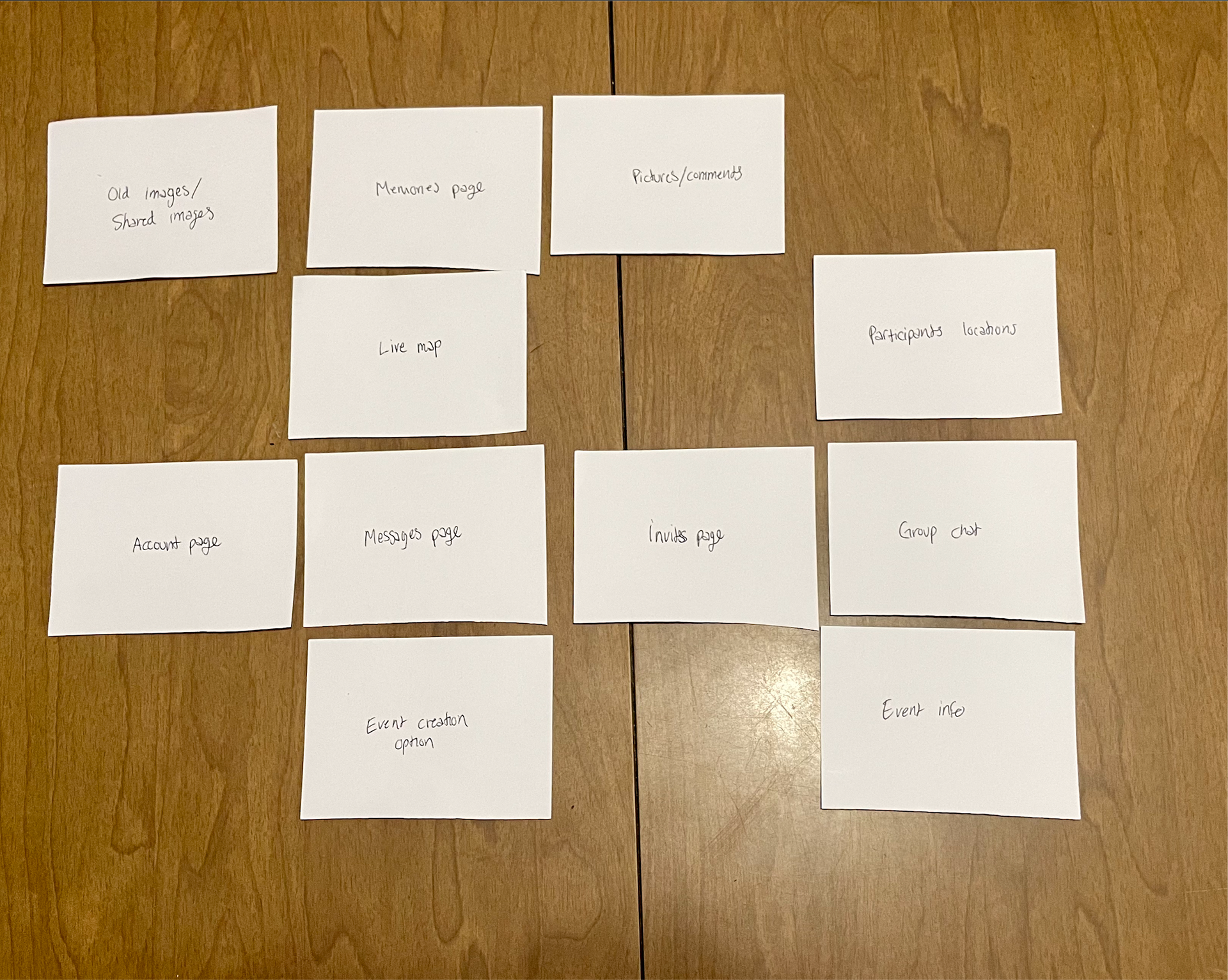
We decided to use the card-sorting research strategy because we found that we had an abundance of features in our app concept and needed outside parties to decide which features were more important to them than others. The card-sorting method allowed us to see what features are more desirable to potential users so that we could shift our focus onto those, rather than spend time on a certain aspect of the app that no one would actually use. This will help us save a lot of time and money in the long run, as we will have data that proves what users actually want from our app instead of just guessing through trial and error.
Fly on the Wall
We chose to enact this research tactic to prove that there is a desire for streamlining the process of planning an event. We knew that there were other social planning platforms that exist and we wanted to see whether or not people in our target demographic actually use them. This test was designed so that there was little interaction between the participants and us. We provided a situation and watched what actions they performed. Because we found that people mostly plan events over text or email and have pain points during that process, our hypothesis that there is a need for a social planning app was confirmed. All of our participants had used Facebook events in the past, but no longer use it because they either no longer use Facebook, or guests they would invite no longer use Facebook.
Historical Analysis
We decided that it was important to research the history of social event-planning platforms to see why people do not use them often. We wanted to see if a concept like ours had failed in the past, and if so, why. We also wanted to learn how small startup social media apps could compete in the industry today. The most interesting concept that arose from this research was the way that the BeReal app was able to amass a large user base in a short amount of time. Their college ambassador program would potentially be the perfect method for our app to gain popularity, as it could help when planning fraternity and sorority events.
Our Findings
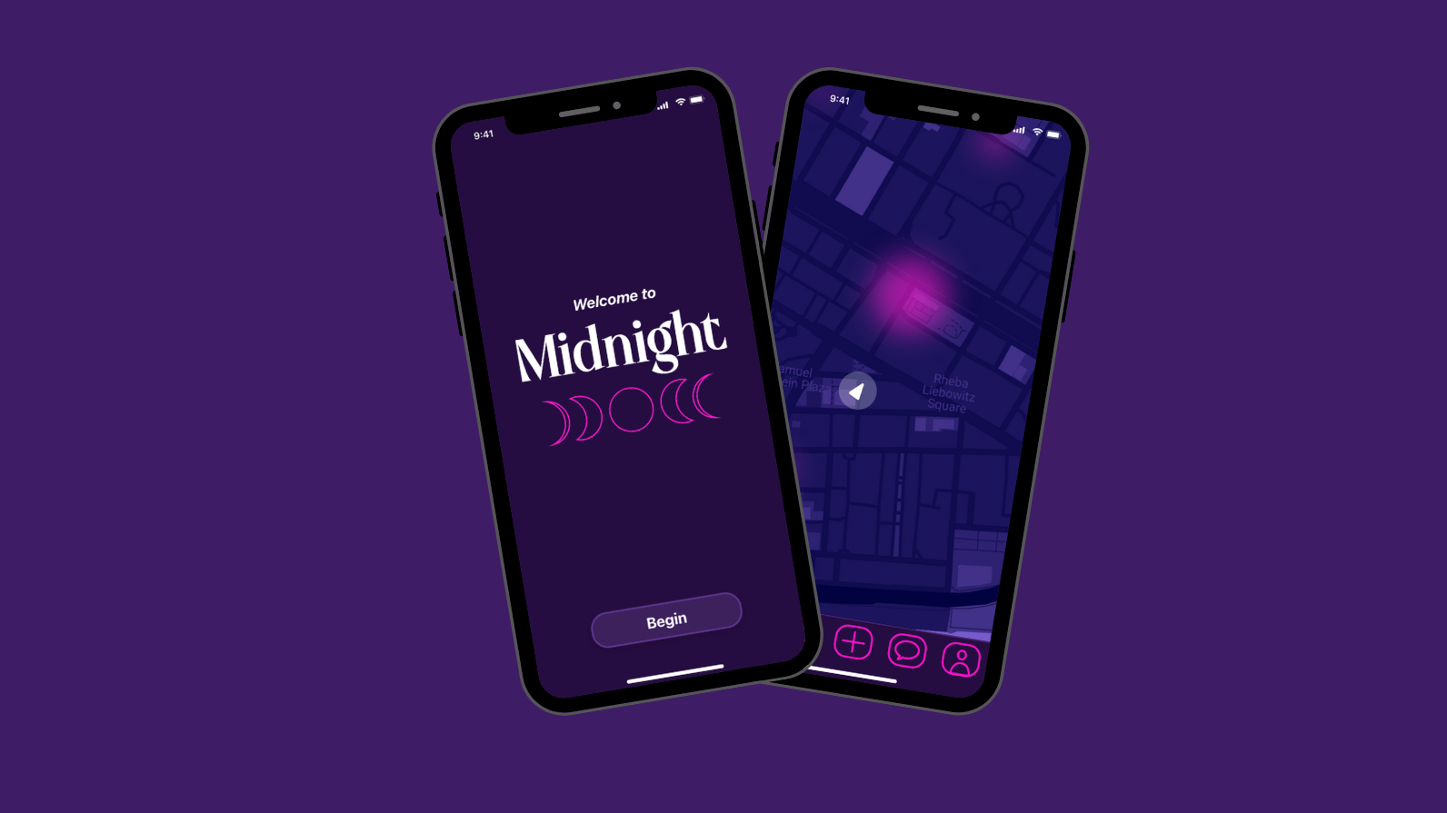
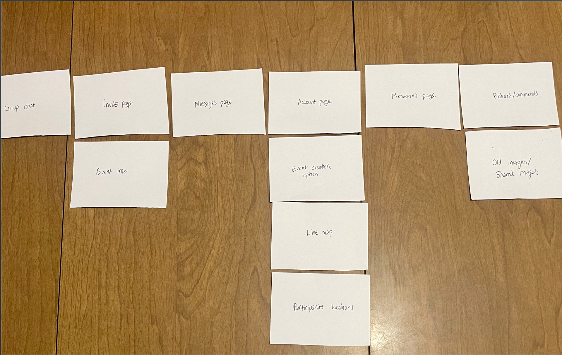
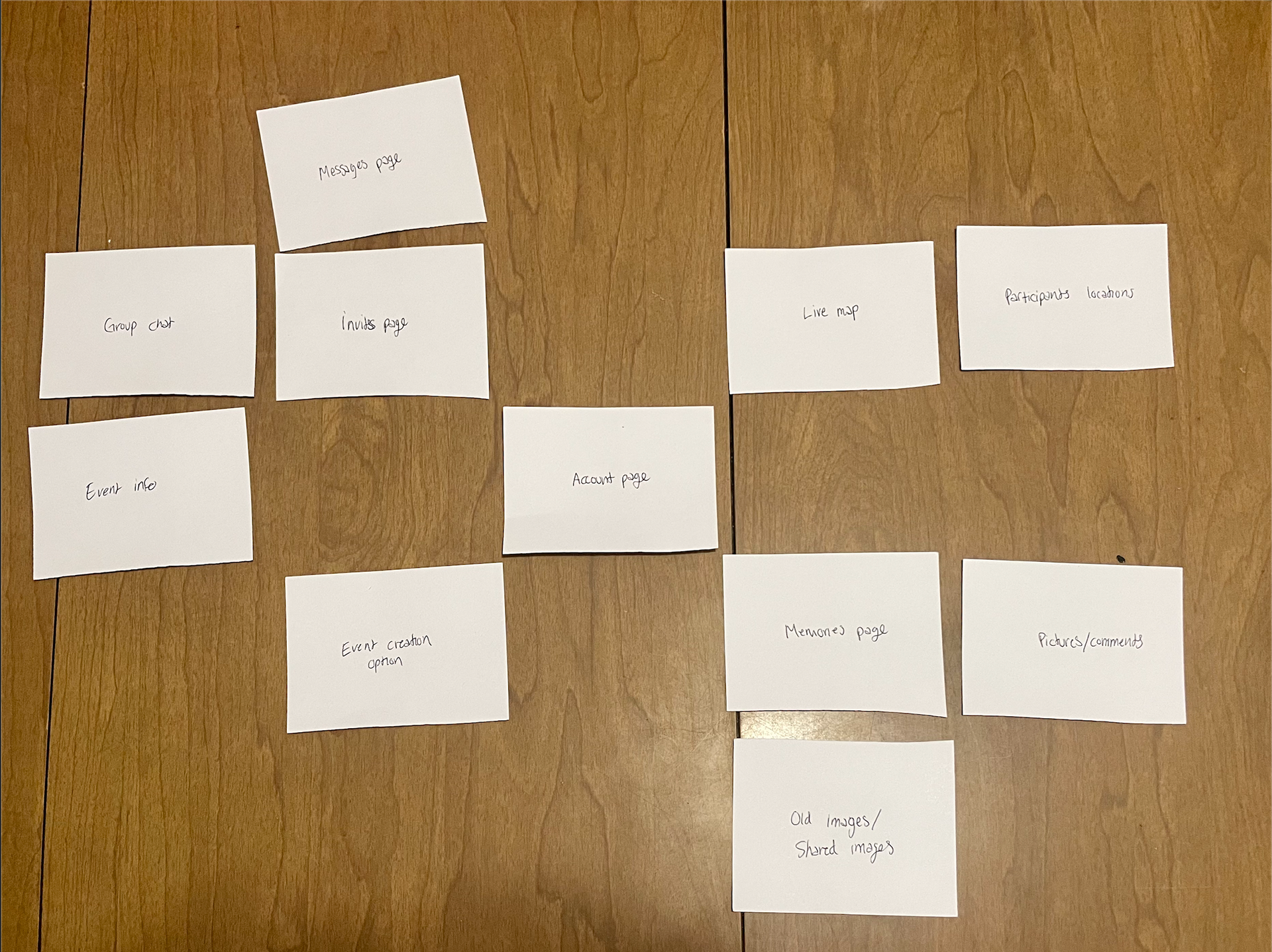
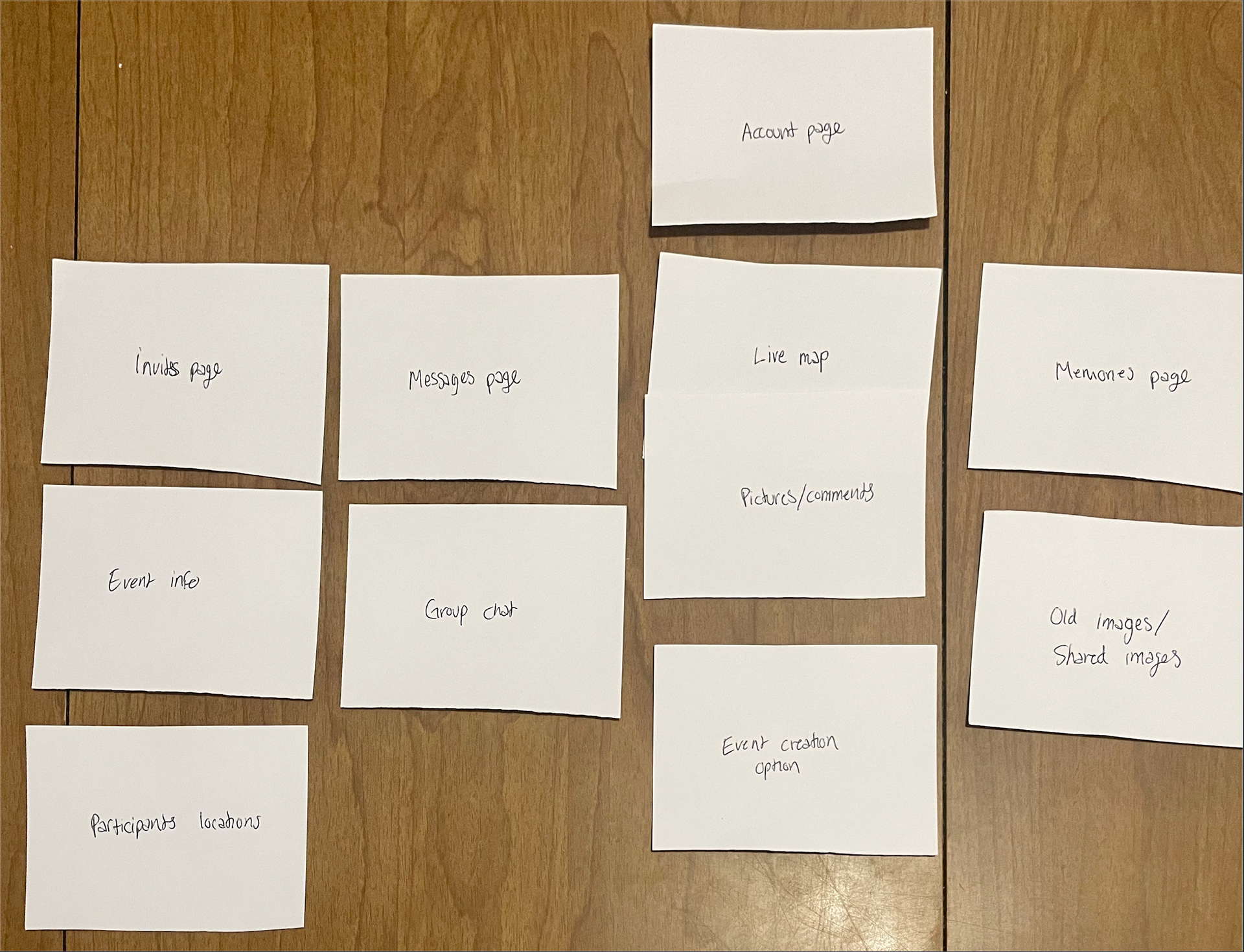
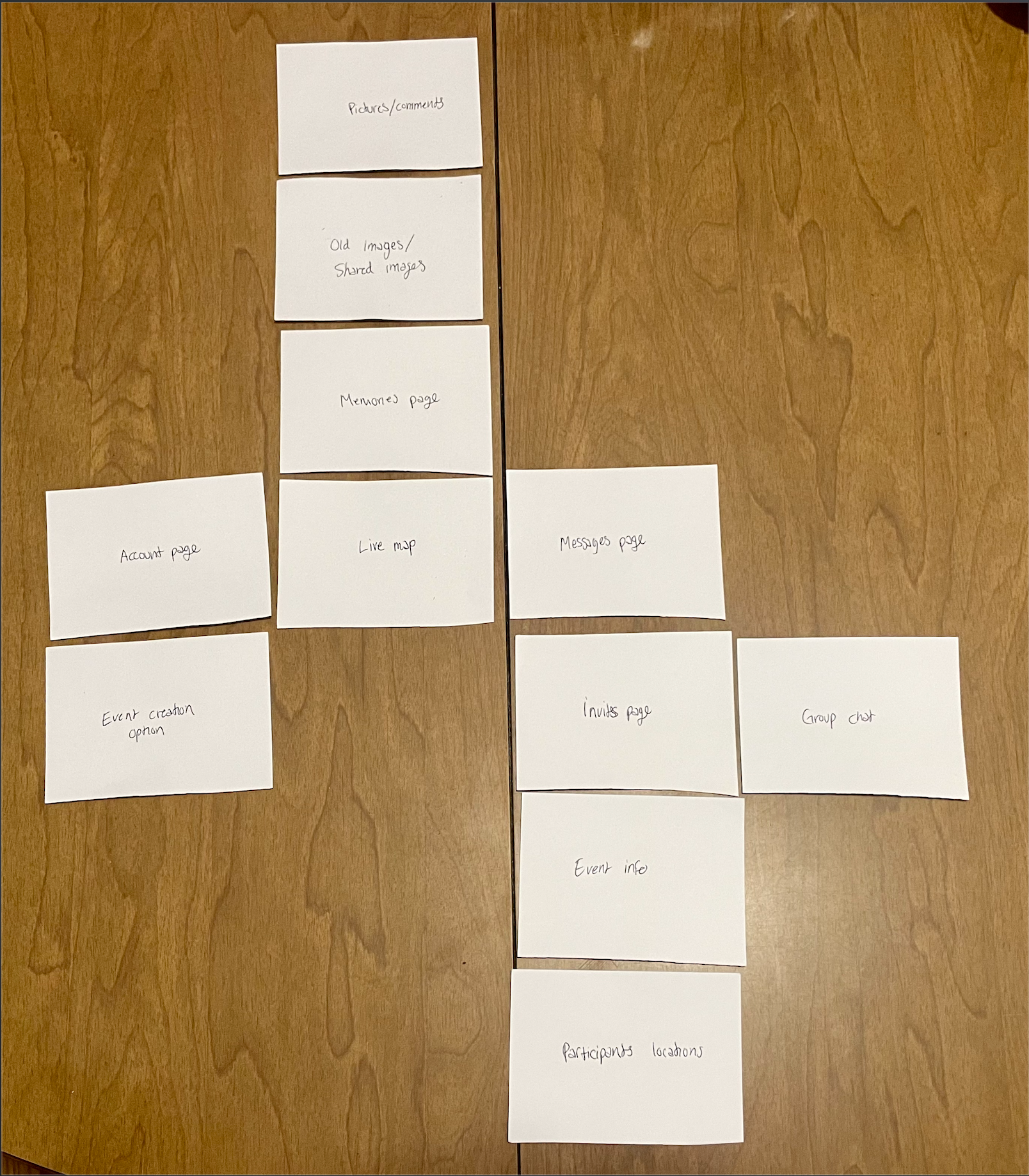
For our research, we used three vastly different methods of gauging the wants and needs of our target users. The first method that we used was a card sorting method where outside parties would take the notecards with all of the apps’ possible features and arrange them in a layout that they would find most desirable in app form. The main thing that we learned from this activity was the fact that other than a few main features, the layout varied greatly from user to user. However, this does not mean that there wasn’t any valuable information collected from this method. The common denominator out of all of the layouts was the placement of the live map feature as the starting screen for the app. Almost all of the users agreed that the main page should be the map showing all nearby events and the number of people at said events. We also found that most of the users also agreed upon the groupings of the features. For example, while the placement of the chat feature was different for each user, the idea that the invite page, messages, and event information should be grouped together can be found in all of the layouts. The main takeaway from this method of research is that while the overall layout of the app can vary and still be effective, the features must be logically grouped with other similar or related features.
The next method we used was the fly-on-the-wall method. This research technique was very helpful in a few different ways and is definitely going to affect our final product the most. The most obvious takeaway from this method was the fact that no matter how the outside party attempted to organize a party/event, there was always some confusion about the logistics and details that had to be cleared up via phone or text. This solidified our idea that we should include a feature that automatically creates a group chat with all of the invited people so that any questions/concerns could be addressed within the app. We also found that this research proved that a bio of sorts for the event would be necessary, where any and all details about the event would be presented in a clear and concise format. Another important takeaway that we found was the importance of a feature that made those participating in the event aware of any payment necessary to attend the event. This was something that we had not thought of before, but after recognizing this problem in our research, it is now something that we are looking into adding to our prototype.
Our final research method for this project was the use of historical analysis and looking back at other successful social media/app companies and how they achieved their success. After looking into these massive platforms there was only one real takeaway, the idea that in order for our app to be successful, it must target a smaller, more niche market so that we can provide the best user experience possible in that field.
Appendix
Card Sort
For this research method, we wrote our ideas for potential features in the app on pieces of paper and let our participants rank which features they favored more than others. Here were our findings:
Participant 1: Chris R. (College Junior), Participant 2: Quinn P. (College Junior), Participant 3: Matt C. (College Junior), Participant 4: Javier A. (College Junior), Participant 5: Abbie G. (College Senior):
Fly on the Wall
For our “fly on the wall” user research, we asked our participants to pretend they were planning a birthday party for a friend. We then watched our participants act out the steps they would take to plan this event and invite guests. There was a range of methods used to accomplish this, as follows:
Participant 1: Lauren G. (Recent College Graduate)
Lauren created a group chat on the app GroupMe to ask a group of ten people what days they are available, what food and drinks they want and who will provide them, and who can provide a venue to host the party. She found it challenging to organize the different opinions in the group chat, so she created an online poll that helped her answer these questions more easily. Lauren then texted a few of the guests individually on iMessage to sort out logistical factors, mostly payment.
Participant 2: Maiya V. (Adult)
Maiya decided to format an email explaining the location, theme, dress code, date, and time for the event. She then sends this email to a list of close friends she often sees at other social gatherings. For individual communication with guests, she called a few people on their cell phones to answer any questions that arose from her initial email.
Participant 3: Jonathan C. (College Senior)
Jonathan decided to create an excel spreadsheet listing guests that he wanted to invite to this event. He then created an iMessage group chat providing the guests on the spreadsheet with the information they needed to attend the event.
Participant 4: Mia G. (College Junior)
Mia first made all the logistical decisions regarding the event on her own. She then created an iMessage group chat to notify the guests of the event’s location, date, time, and theme.
Participant 5: Eve B. (College Senior)
Eve first created a graphic invitation that showed all the important information for the event, while also looking aesthetically pleasing. She then sent this invitation to guests individually over iMessage.
Historical Analysis
Social planning software on the internet originated as a method for people to RSVP for significant events such as weddings, holidays, and family reunions. One website that found success in the early 2000s and continues to run to this day is Evite. Evite allows users to create, send, and manage invitations. This company is successful in its niche of formal events but does not offer much functionality beyond sending invitations. Other digital tools for event planning have been developed in the years since Evite launched, most notably Facebook.
Facebook was founded in 2004 and revolutionized the social media landscape. In 2005 the company launched the events page, creating a seamless social planning experience. This page shows users different events in their area, allowing them to show interest and share the event on their timeline with other users. It is easy for users to create their own event by simply pushing the “Create new event” button, filling out the logistical information guests need to know, and inviting friends to the event. In my personal experience, this is the most intuitive events planning software I have used, but in recent years young people have been moving away from Facebook as a platform entirely. The negative press surrounding the company in regard to data mining has led people to abandon the website, making it difficult for users who want to utilize the events page to invite some of their friends.
Massive social media platforms like Tik Tok, Instagram, and Facebook control the social media industry and would not be our competitors. Our app would target a smaller niche market segment, much like what BeReal has done recently. BeReal is a French social media app founded in 2020 and already has 21 million users. The app's concept is to show your life as it is, commenting on the fake nature of platforms like Instagram and Facebook. Users post a single picture of whatever they are doing at the time during a two-minute window once every day. Users can only see their friends' pictures after they post their own, benefitting from users’ curiosity. BeReal found success quickly due, in large part, to its paid college ambassador program. Here is an excerpt from the BeReal website explaining exactly how this program works:
“We’re creating a college presence that embodies our brand and serves as an extension of our full-time team. BeReal college ambassadors host parties, manage a marketing budget, identify key moments on campus for us to get involved, represent BeReal’s mission, and execute creative activations. Our ambassadors get to be part of the next unicorn start-up, receive mentorship from our global team of experienced entrepreneurs, and enjoy great pay!”
This was a successful method of advertising their app among people in their target market, while also benefiting students interested in app development. We believe this method is the best way for new social media platforms to spread within their niche, and we think this is how we should advertise our app.
Low-Fidelity Prototype Survey Results
Heuristics Evaluation of Midnight
By User Lauren G., Quinn P., and Javier A. Date November 15, 2022
Task 1: Sign up
Task 2: Create an account
Task 3: Create Event/Invite guests
Task 4: Search for events
Task 5: Find event messages
Task 2: Create an account
Task 3: Create Event/Invite guests
Task 4: Search for events
Task 5: Find event messages
Severity scale:
0 - don’t agree that this is a usability problem
1 - cosmetic problem
2 - minor usability problem
3 - major usability problem; important to fix
4 - usability catastrophe; imperative to fix
1 - cosmetic problem
2 - minor usability problem
3 - major usability problem; important to fix
4 - usability catastrophe; imperative to fix
1. Match between the system and the real world
- Speak the users' language, with words, phrases, and concepts familiar to the user, rather than system-oriented terms.
- Follow real-world conventions, making information appear in a natural and logical order.
- Follow real-world conventions, making information appear in a natural and logical order.
Evaluation
Describe the problem, using screenshots if it is necessary:
- Lauren had no difficulty with this aspect of the prototype.
- Quinn found the language and order of the prototype to his liking.
- Javier had no problems with this.
- Lauren had no difficulty with this aspect of the prototype.
- Quinn found the language and order of the prototype to his liking.
- Javier had no problems with this.
Severity scale:
- 0
- 0
- 0
- 0
- 0
- 0
A possible solution if your tester has:
- N/A
- N/A
- N/A
- N/A
- N/A
- N/A
2. Consistency and standards
- Users should not have to wonder whether different words, situations, or actions mean the same thing.
- Follow platform conventions.
- Follow platform conventions.
Evaluation
Describe the problem, using screenshots if it is necessary:
- Lauren commented that the size of the main text fonts are slightly different on different pages.
- Quinn had no problem understanding the wording or actions needed to complete the tasks.
- Javier thought the wording and typeface were pretty consistent and he understood what was a title and what was instructional
Severity scale:
- 1
- 0
- 0
- 1
- 0
- 0
A possible solution if your tester has:
- Look through all the sizes of text elements and make sure they align.
- N/A
- N/A
- Look through all the sizes of text elements and make sure they align.
- N/A
- N/A
3. Aesthetic and minimalist design
- Dialogues should not contain information that is irrelevant or rarely needed.
- Every extra unit of information in a dialogue competes with the relevant units of information and diminishes their relative visibility.
- Every extra unit of information in a dialogue competes with the relevant units of information and diminishes their relative visibility.
Evaluation
Describe the problem, using screenshots if it is necessary:
- Lauren had no issues with this element of the prototype’s design.
- Quinn had no problems with the dialogues or information in the prototype.
- Javier thought the dialogue was well-worded and to the point.
- Lauren had no issues with this element of the prototype’s design.
- Quinn had no problems with the dialogues or information in the prototype.
- Javier thought the dialogue was well-worded and to the point.
Severity scale:
- 0
- 0
- 0
- 0
- 0
- 0
A possible solution if your tester has:
- N/A
- N/A
- N/A
- N/A
- N/A
- N/A
4. User control and freedom
- Users often choose system functions by mistake.
- Provide a clearly marked "out" to leave an unwanted state without having to go through an extended dialogue.
- Support undo and redo.
- Provide a clearly marked "out" to leave an unwanted state without having to go through an extended dialogue.
- Support undo and redo.
Evaluation
Describe the problem, using screenshots if it is necessary:
- Lauren had no issues with this element of the prototype’s design.
- Quinn had no problems navigating the prototype.
- Javier found the consistency of the exit page arrows helpful.
- Lauren had no issues with this element of the prototype’s design.
- Quinn had no problems navigating the prototype.
- Javier found the consistency of the exit page arrows helpful.
Severity scale:
- 0
- 0
- 0
- 0
- 0
- 0
A possible solution if your tester has:
- N/A
- N/A
- N/A
- N/A
- N/A
- N/A
5. Recognition rather than recall
- Make objects, actions, and options visible.
- Users should not have to remember information from one part of the dialogue to another.
- Instructions for use of the system should be visible or easily retrievable whenever appropriate.
- Users should not have to remember information from one part of the dialogue to another.
- Instructions for use of the system should be visible or easily retrievable whenever appropriate.
Evaluation
Describe the problem, using screenshots if it is necessary:
- Lauren had no issues with this element of the design.
- Quinn had no issues with any of the actions within the app and was able to navigate the app easily.
- Javier had no issues with this.
- Lauren had no issues with this element of the design.
- Quinn had no issues with any of the actions within the app and was able to navigate the app easily.
- Javier had no issues with this.
Severity scale:
- 0
- 0
- 0
- 0
- 0
- 0
A possible solution if your tester has:
- N/A
- N/A
- N/A
- N/A
- N/A
- N/A
6. Flexibility and efficiency of use
- Accelerators -- unseen by the novice user -- may often speed up the interaction for the expert user so that the system can cater to both inexperienced and experienced users.
- Allow users to tailor frequent actions.
- Allow users to tailor frequent actions.
Evaluation
Describe the problem, using screenshots if it is necessary:
- Lauren said that she had no difficulty understanding what the icons at the bottom of the page meant, but she could see how someone with less experience with social media apps could be confused by their meanings.
- Quinn was confused by the money symbol on the profile page and thought it meant that the user had a premium account.
- Javier was confused by the settings symbol because he thought it was the button to edit your profile.
Severity scale:
- 1
- 1
- 1
- 1
- 1
- 1
A possible solution if your tester has:
- Add a small label underneath the icons telling the user exactly what they do.
- Possibly edit or change the icon to a wallet to clarify its purpose.
- Change the location or add a clear edit profile button.
- Add a small label underneath the icons telling the user exactly what they do.
- Possibly edit or change the icon to a wallet to clarify its purpose.
- Change the location or add a clear edit profile button.
7. Visibility of system status
- Always keep users informed about what is going on.
- Provide appropriate feedback within a reasonable time frame.
- Provide appropriate feedback within a reasonable time frame.
Evaluation
Describe the problem, using screenshots if it is necessary:
- Lauren had no issues with this aspect of the prototype’s design.
- Quinn enjoyed the check mark responses to completing the profile and finishing some actions.
- Javier thought that the app was successful in this area. He also added that he liked how the icons changed to show what screen the user is on.
Severity scale:
- 0
- 0
- 0
- 0
- 0
- 0
A possible solution if your tester has:
- N/A
- N/A
- N/A
- N/A
- N/A
- N/A
8. Error prevention
- Even better than good error messages is a careful design that prevents a problem from occurring in the first place.
Evaluation
Describe the problem, using screenshots if it is necessary:
- Lauren said that the app’s design was very smooth and intuitive, and she didn’t see how most other people would run into any errors or issues.
- Quinn found no areas where he got stuck or needed assistance.
- Javier ran into no errors and had a good overall experience.
- Lauren said that the app’s design was very smooth and intuitive, and she didn’t see how most other people would run into any errors or issues.
- Quinn found no areas where he got stuck or needed assistance.
- Javier ran into no errors and had a good overall experience.
Severity scale:
- 0
- 0
- 0
- 0
- 0
- 0
A possible solution if your tester has:
- N/A
- N/A
- N/A
- N/A
- N/A
- N/A
9. Help users recognize, diagnose, and recover from errors
- Expressed in plain language (no codes)
- Precisely indicate the problem
- Constructively suggest a solution.
- Precisely indicate the problem
- Constructively suggest a solution.
Evaluation
Describe the problem, using screenshots if it is necessary:
- Lauren commented that if a user ran into an error, they would easily be able to go back to a previous page and use a different button to find what they were looking for.
- Quinn liked that all of the pages that needed it had a back arrow so he could retrace his steps.
- Javier found that aside from the arrows, taping the icons again would allow him to start over from the main page of each icon.
Severity scale:
- 0
- 0
- 0
- 0
- 0
- 0
A possible solution if your tester has:
- N/A
- N/A
- N/A
- N/A
- N/A
- N/A
10. Help and documentation
- Even though it is better if the system can be used without documentation, it may be necessary to provide help and documentation.
- Help information should be easy to search, focused on the user's task, list concrete steps to be carried out, and not be too long.
- Help information should be easy to search, focused on the user's task, list concrete steps to be carried out, and not be too long.
Evaluation
Describe the problem, using screenshots if it is necessary:
- Lauren said that there is no help documentation, so users must figure out how the app functions on their own, but she restated the fact that the app is designed intuitively and users can easily figure out functionality on their own.
- Quinn said it might be helpful to add an intro/tutorial so that the user is walked through all of the important icons and actions without having to explore the app themselves.
- Javier noted that there was no help page but said that he didn’t think the app needed one.
Severity scale:
- 0
- 2
- 0
- 0
- 2
- 0
A possible solution if your tester has:
- Add a “help” or “FAQ” page in the settings.
- Possibly add pop-up labels that appear the first time clicking on an icon.
- N/A
- Add a “help” or “FAQ” page in the settings.
- Possibly add pop-up labels that appear the first time clicking on an icon.
- N/A
Solutions to Critiques
High-Fidelity Prototype Moderated Research
[5] participants, having the following characteristics, evaluated [https://xd.adobe.com/view/2694cde9-2ddd-44d9-bda9-ac5c8fc63112-73c7/] (See prototype in Midnight App tab)
Tasks
Task 1: Sign up
Task 2: Create an account
Task 3: Create Event/Invite guests
Task 4: Search for events
Task 5: Find event messages
Task 2: Create an account
Task 3: Create Event/Invite guests
Task 4: Search for events
Task 5: Find event messages
Task Completion Rate
