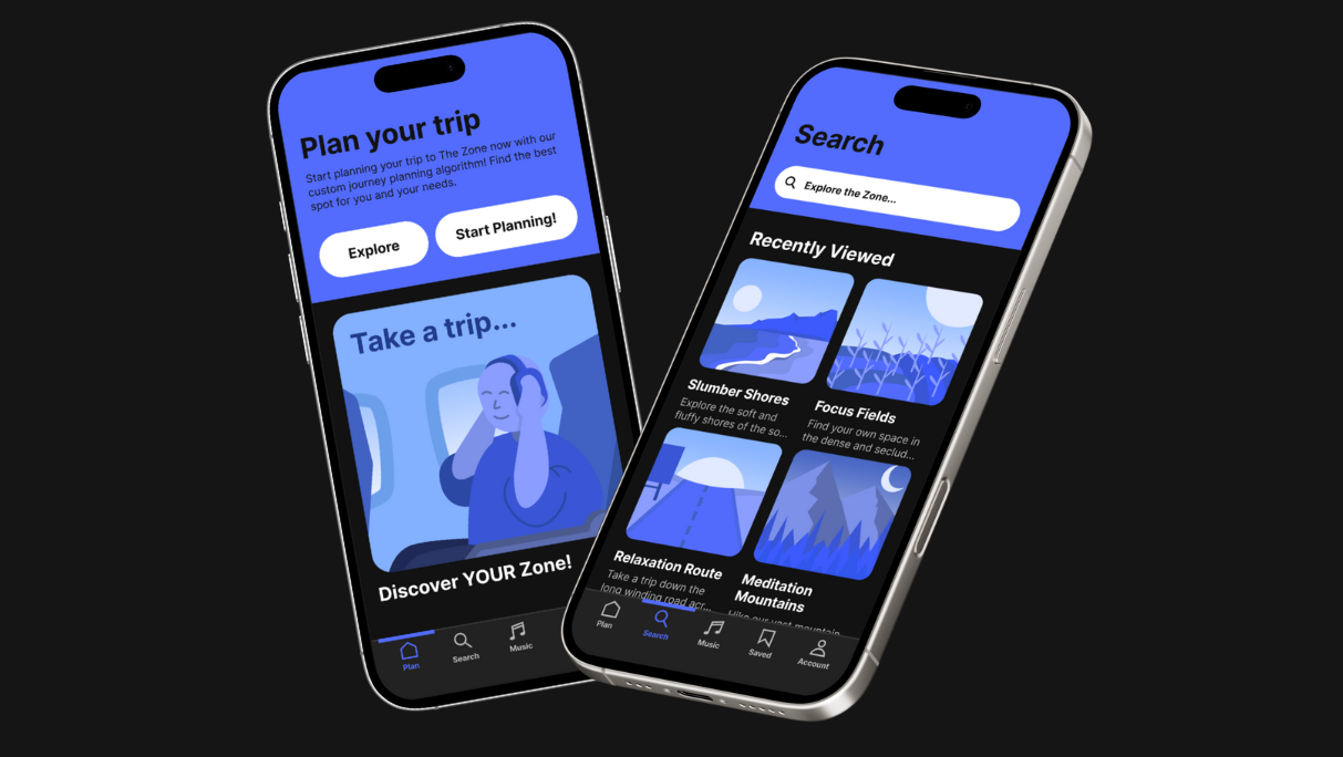
Midnight App Presentation and High-Fidelity Prototype
High-Fidelity Prototype (Midnight App)
Interaction Design 345
Project Description:
Design an app that allows users to discover and plan events. The app would let users log their locations, showing on a public map how many people are at a specific location. The app would allow users to create their own events pages, invite friends to a location and give group text functionality. On each event page, there would be a public photo gallery posted by users, letting other users know what is happening at the event. Users would be given the option to make their event either public or private. If private, users would invite other users to their event page. If public, the event and its location would be displayed on the public map.
The team:
Teddy Verrone and Kai Mendoza
Teddy will focus on prototyping the app.
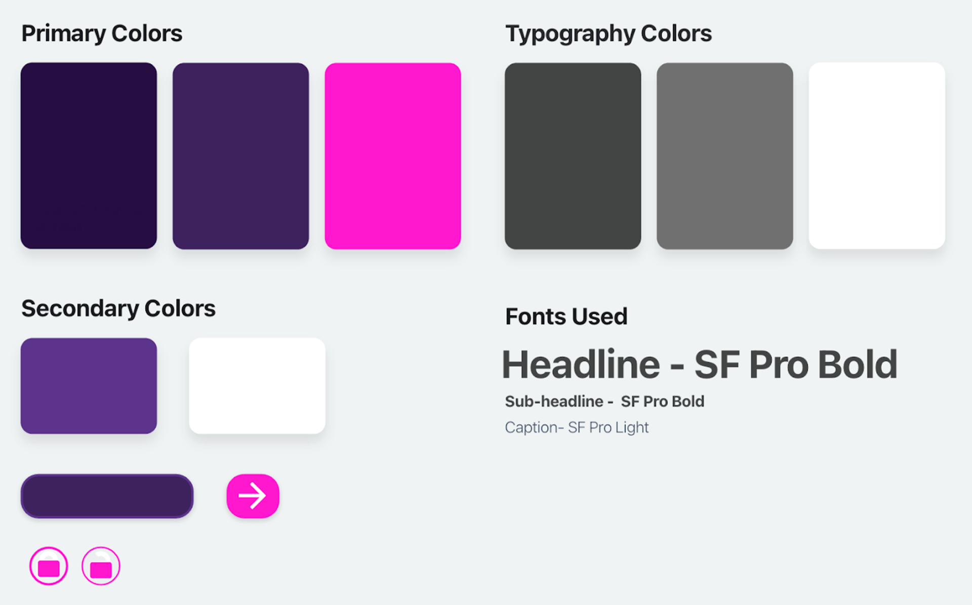
Kai will focus on the app’s branding (logos, fonts, color scheme, etc.)
Teddy will focus on prototyping the app.
Kai will focus on the app’s branding (logos, fonts, color scheme, etc.)
Research Questions:
- How do you look for events when in an unfamiliar place?
- What information do you need to plan an event?
- How do you plan events currently?
- How do you find events currently?
- Do you prefer apps with specific use cases or apps with many features?
- What information do you need to plan an event?
- How do you plan events currently?
- How do you find events currently?
- Do you prefer apps with specific use cases or apps with many features?
User Persona:
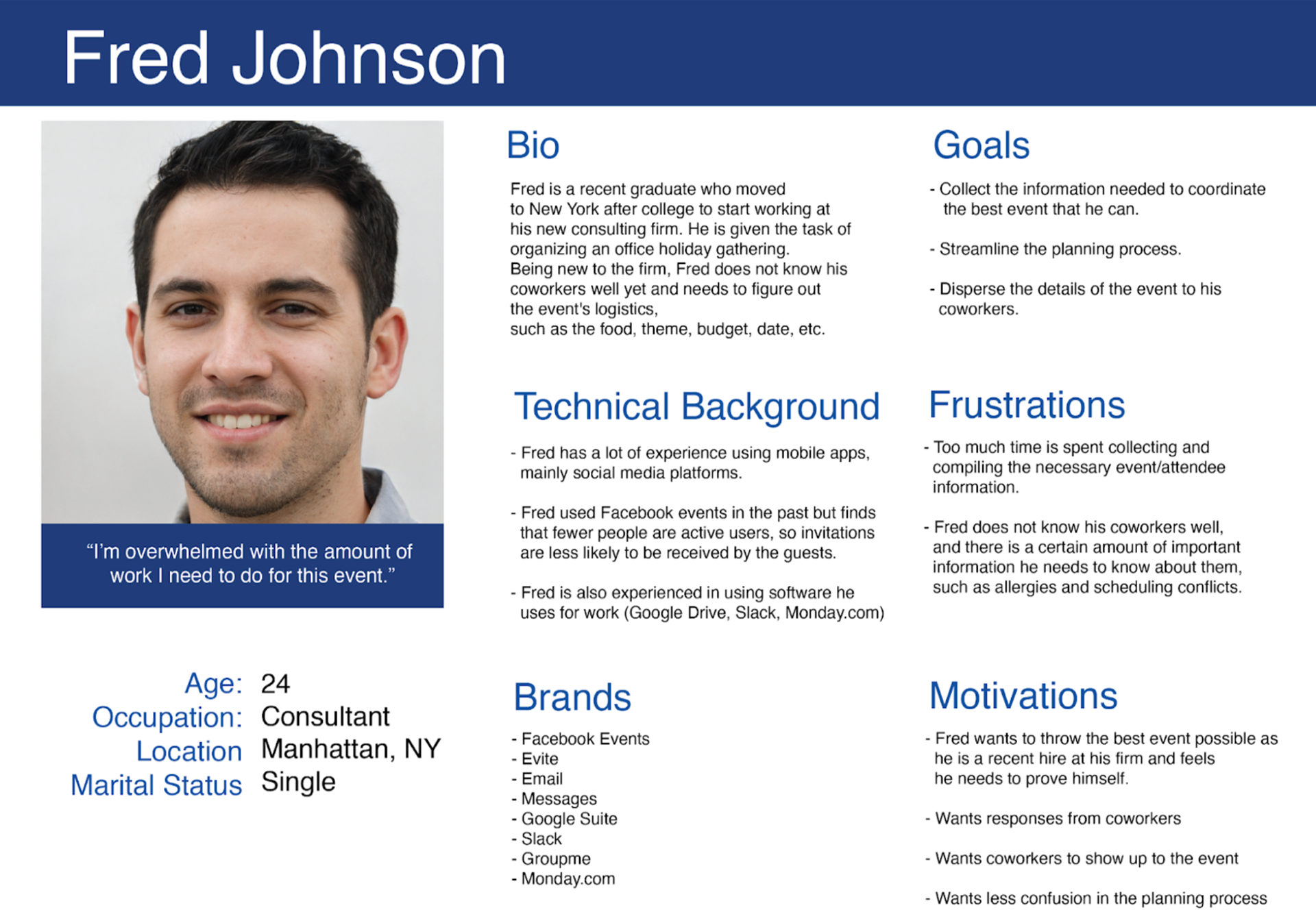
Target Audience:
Our target users will be people between the ages of 18-35 who enjoy large group environments such as sporting events, nightclubs, and concerts. Our target users will also be persons who are not satisfied with the services or processes they currently use to plan, seek out, or discover new events.
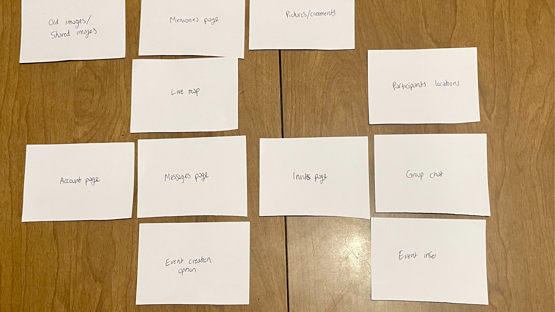
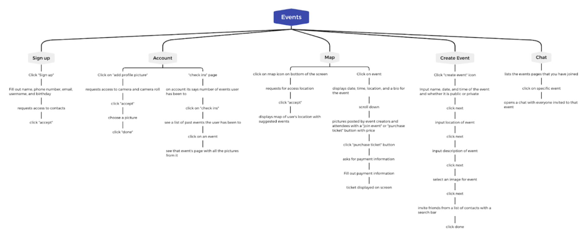
User Flow:
Process:
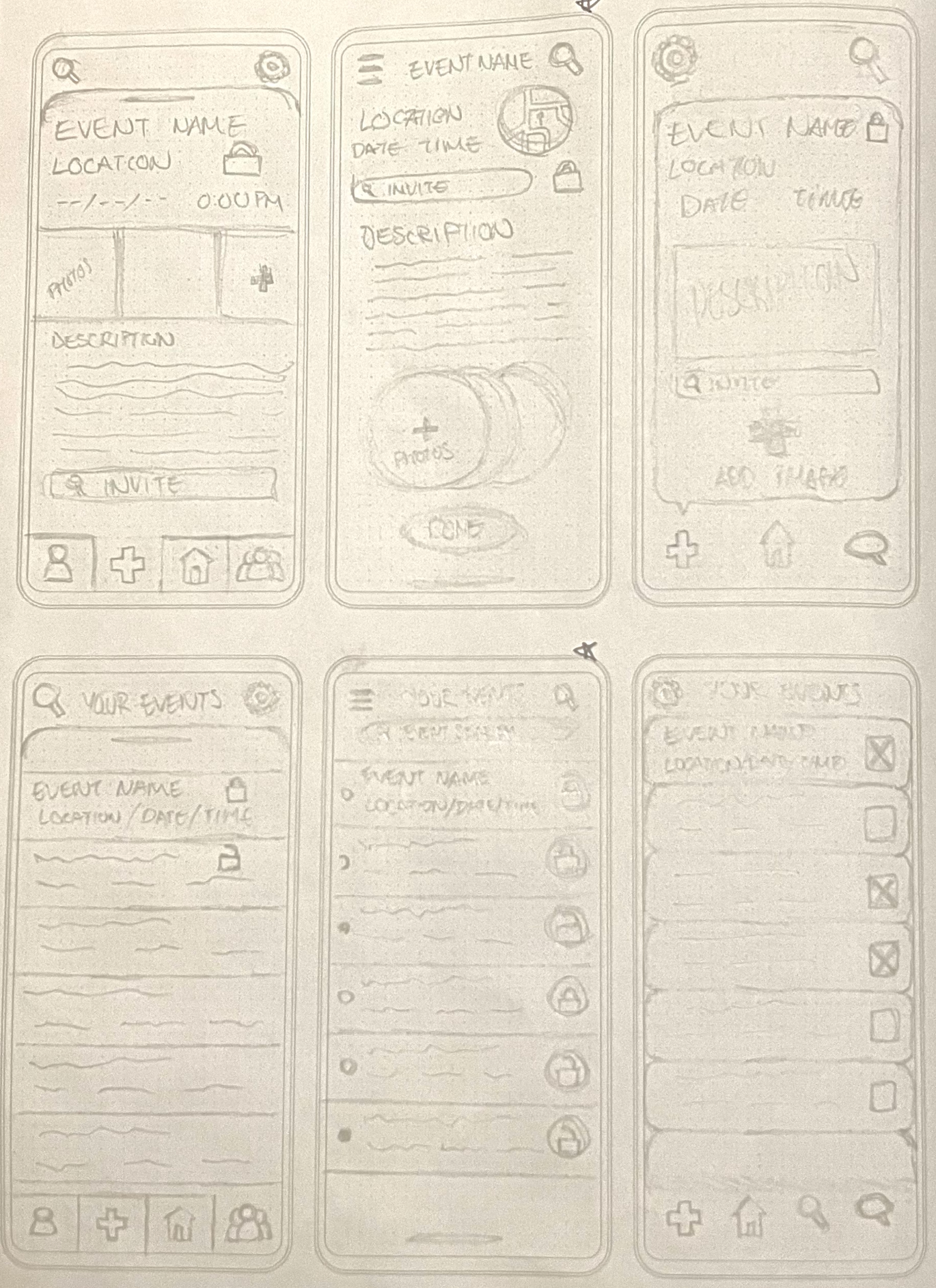
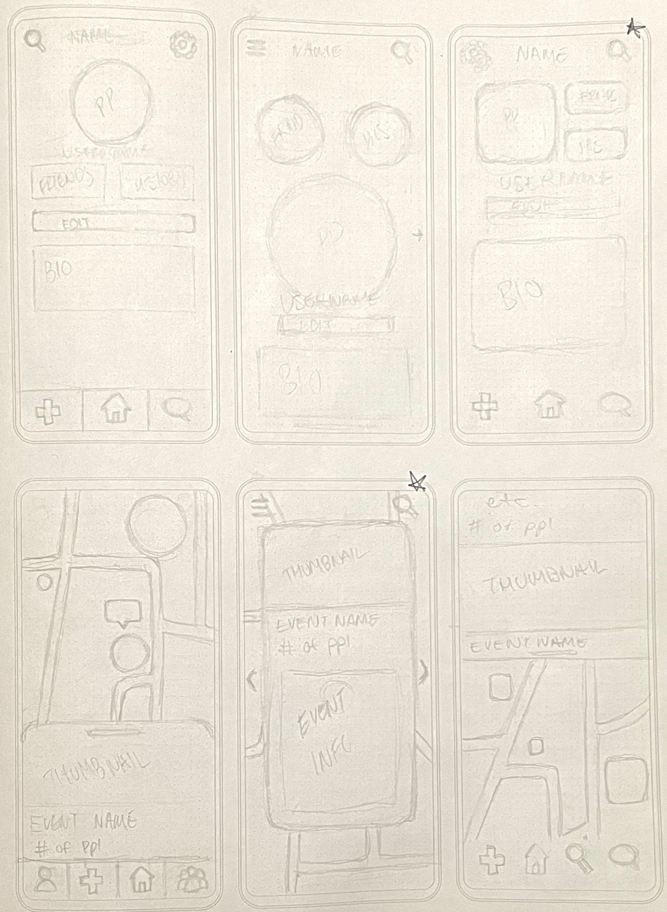
For our sketches, we arranged the important element on each screen in different ways to convey different design principles. The leftmost sketch in each photo above emphasizes functionality and usability. For that design, we were inspired by other popular social media apps and their original user interfaces. While not the most unique or aesthetically pleasing, social media users have been trained by other apps to find this layout intuitive. For the middle sketch in the photos, we used a more experimental and unique layout that would visually set our app apart while retaining the important elements for functionality. This design relies on users knowing to swipe to change the screens and not offering any button or visual element to do so. While losing some functionality, this feature would create a more modern and streamlined design and has been proven to work by apps like Snapchat. The set of sketches on the right in the photos aims to find a compromise between the two previous styles. We wanted to keep much of the functionality of the left sketches and combine that with the modern, sleek design of the middle sketches. We believe that we have found a good compromise between the two styles in the sketches on the right.
Style Guide: